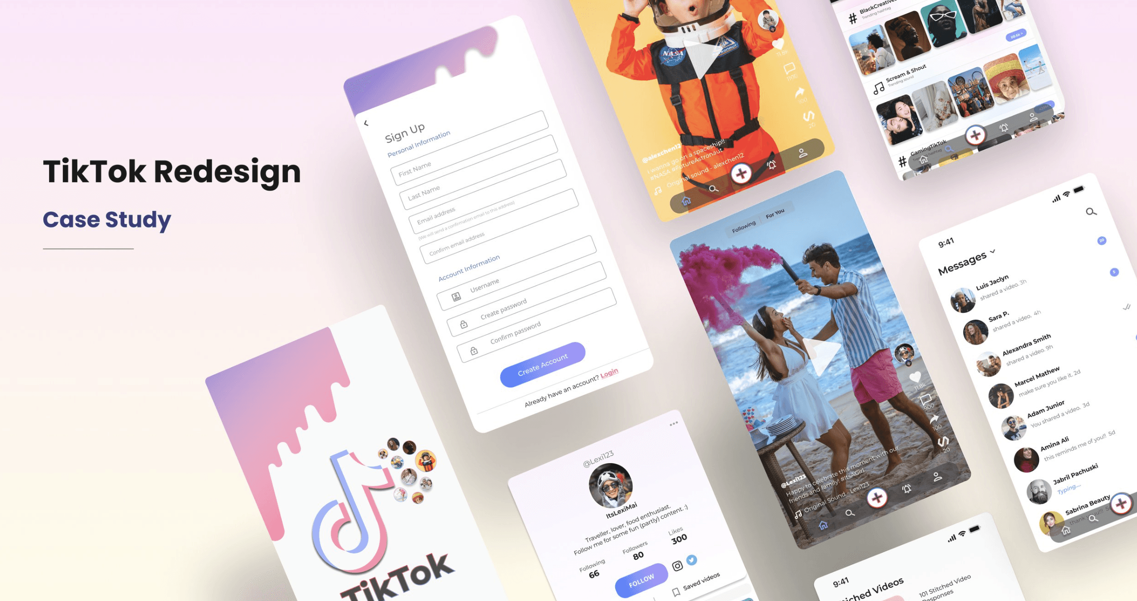
TikTok Redesign
This case study focuses on the redesign of the TikTok user experience to improve its functionality, organization, and user-friendliness. Through user feedback and observational sessions, this study highlights the pain points and problems faced by TikTok users, including a lack of organization and difficulty in finding specific videos.
Role: UX/UI Designer
Responsibilities: Research, UX/UI Design, Problem Solving, Design System
4-weeks
Timeline
UX Designer/Researcher
Role
Project Goal
The goal of this project is to create a more enjoyable and efficient user experience by introducing design solutions. The study documents the research and design process, including the implementation of solutions, ultimately, aiming to enhance the TikTok experience for existing and new users.
Problem Statement
TikTok's current interface lacks organization and functionality, resulting in a frustrating user experience for millions of users. This study aims to address these issues by providing design solutions that enhance the overall TikTok experience
Design Process

Current Pain Points
TikTok is a massively popular social media app that caters to millions of users daily. Despite its immense popularity, the app faces certain pain points and problems that could significantly benefit from a redesign of the user interface. A well-thought-out redesign could enhance the overall user experience, making it more streamlined, intuitive, and enjoyable.
Organization (Categorization): The lack of categorization or subcategories within the "like" feature makes it difficult for users to quickly find specific videos they have favorited. Users have to scroll through a sequential list, which can be time-consuming and frustrating.
User Profiles (Discoverability): Due to the absence of organization on user profiles, finding a specific video becomes challenging. Users have to click on each video individually to know its content, leading to a cumbersome browsing experience and potential frustration.
Stitched Videos (Interactivity): Users are unable to browse through all the stitched videos in response to a particular video. This limits their ability to explore different user responses and see how others have engaged with the content. The lack of this feature restricts interactivity and hinders users' ability to engage with the TikTok community.
Overall User Experience (Streamlining): While TikTok is immensely popular, there is room for improvement in terms of streamlining the user experience. Enhancements to the user interface could make the app more intuitive, reducing friction and enhancing user satisfaction. A well-thought-out redesign would aim to create a smoother, more enjoyable experience for users, resulting in increased engagement and retention.
In which capacities will the design of a user interface solve the identified issue?
The design of a user interface that addresses these issues would significantly enhance the user experience. For example, the ability to organize liked videos into subcategories would make finding specific videos more manageable.
Moreover, redesigning the user profiles and other features would make the experience of watching and creating videos more exciting, and the navigation of the app would become more accessible with a cleaner, modern interface.
Interview Findings
30 participants were interviewed in order to gain insights into the user experience of the TikTok app. The findings identified specific pain points and challenges faced by users, highlighting the need for design improvements. These insights inform the proposed redesign, aiming to enhance user satisfaction and create a more intuitive and enjoyable TikTok experience.

82% of users face difficulty locating previously watched videos on user profiles. The lack of discoverability and organization, coupled with ineffective search options and categorization, frustrates users when trying to find specific videos on a user's profile.
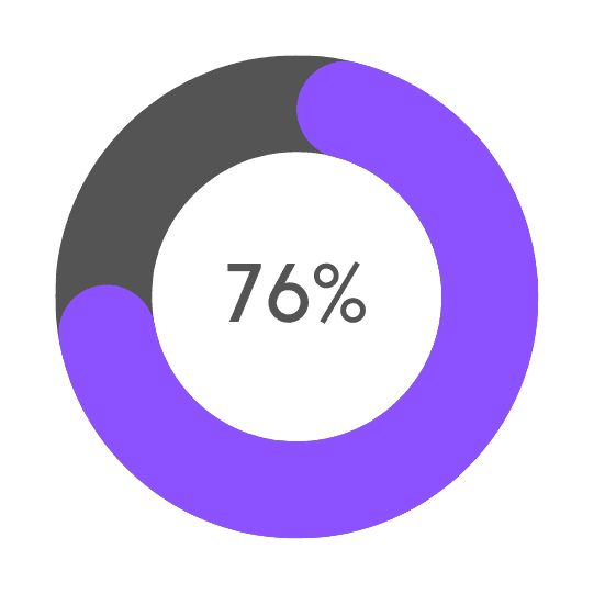
76% of users encounter challenges and frustrations while attempting to stitch their videos or explore stitched content from others. These issues point to usability problems within the feature, including issues with intuitive controls, unclear instructions, and limitations in discovering and engaging with stitched content.
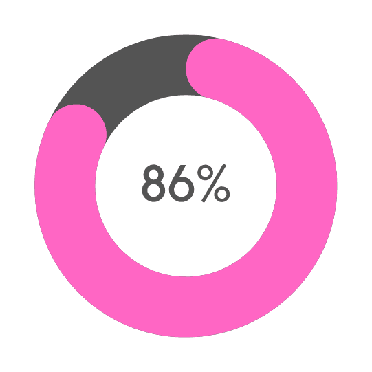
86% of users expressed frustrations with the overall streamlining experience on TikTok. These issues include friction in navigation, unintuitive interface elements, or cumbersome interactions that impede users from seamlessly accessing and enjoying content.
Delving Deeper

Lack of Categorization System:
Users expressed frustration due to the absence of a categorization system on user profiles, making it difficult to find specific videos and hindering content exploration.
Tedious Scrolling through Liked Videos:
Participants found scrolling through the unorganized list of liked videos on user profiles to be time-consuming and cumbersome, resulting in user frustration and decreased efficiency.
Key Takeaways

Inadequate navigation and search options in the "liked videos" section hinder users from easily accessing their favorite content, impacting satisfaction and engagement. Improving categorization, search, or intuitive filtering options can alleviate frustration, enhancing the overall TikTok user experience.
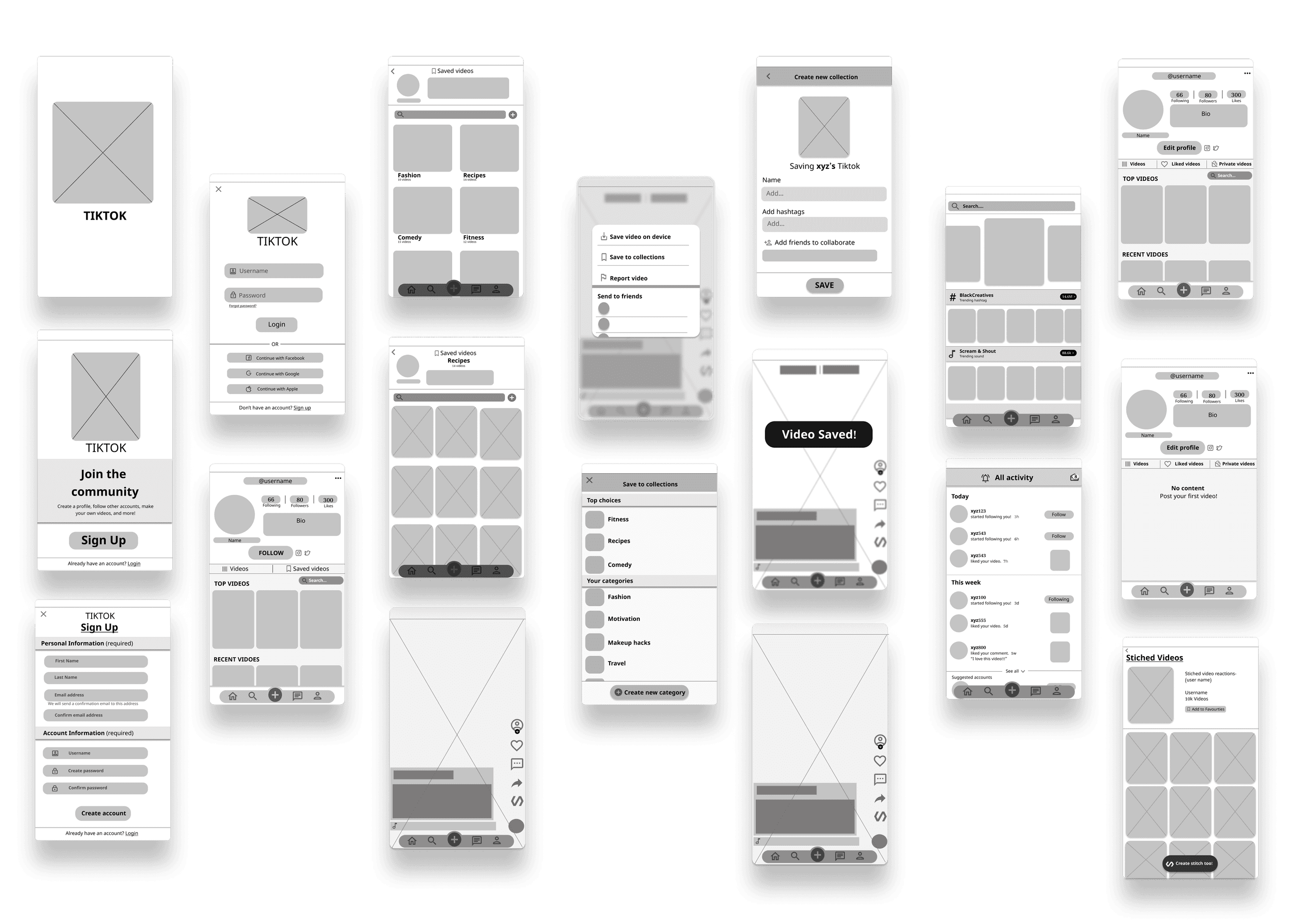
Wireframes
High-Fidelity Design
With this easy registration & quick sign-in process, users can sign up and access TikTok quickly and effortlessly.
This swift and user-friendly registration, complemented by vibrant visuals and simplified sign-in options through existing social media accounts, ensures a positive and enjoyable onboarding experience for effortless exploration of content.

Viewing all stitched videos
The "Stitched" button is a new feature added to the TikTok app that enables users to browse through all the videos that have been "stitched" together.
With the "Stitched" button, users can enjoy an enhanced level of organization and convenience that was previously missing from the app.
View saved videos by category
Users can easily browse through their own and other users' saved videos by category or search, making it easier to find videos of interest.
Simple Video Saving Feature
The solution for the lack of organization within TikTok's "like" feature is to provide users with the ability to create custom categories for their saved videos.
Users can categorize saved videos into pre-existing or new categories, like comedy, food, beauty, etc. They can also search saved videos by keyword, title, or category for a more organized and streamlined user experience.
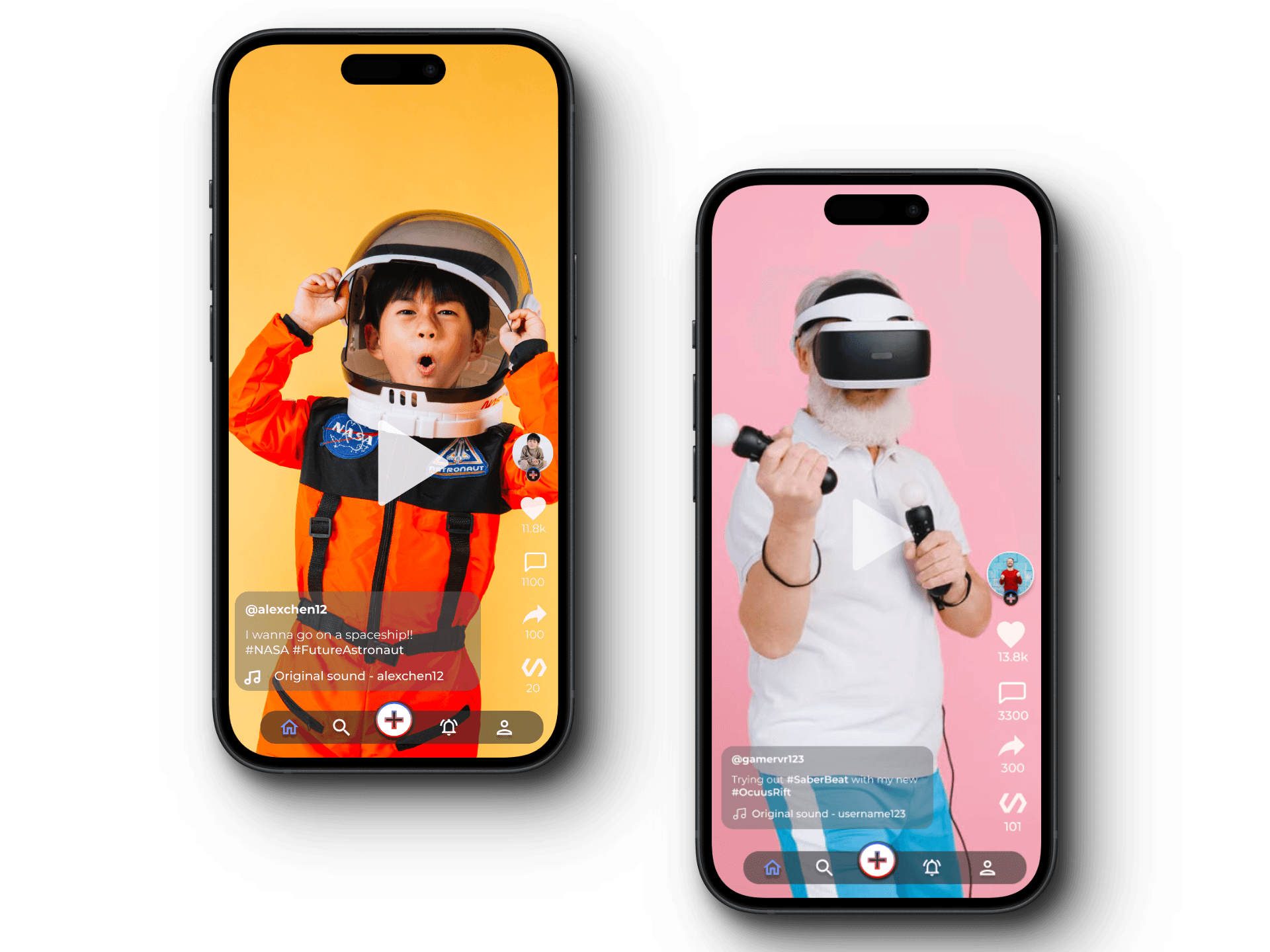
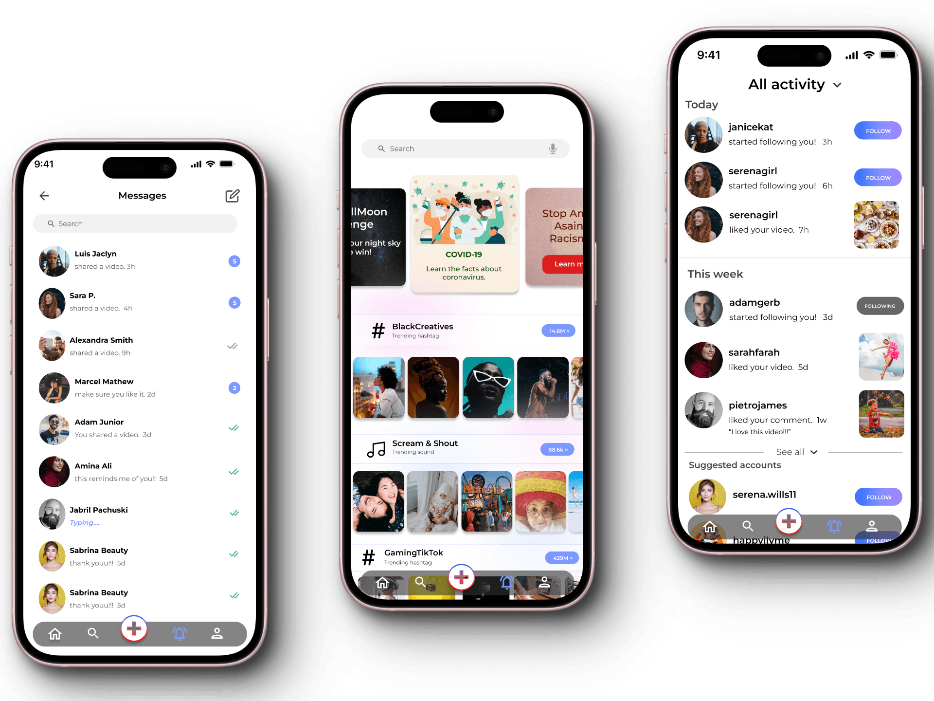
A cleaner and brighter interface
The cleaner and brighter interface provides a refreshed look to the app, making it more modern and appealing to users.
The interface has a minimalist design, with bright colors and large buttons that make it easier for users to navigate and interact with the app.
Better-organized user profile
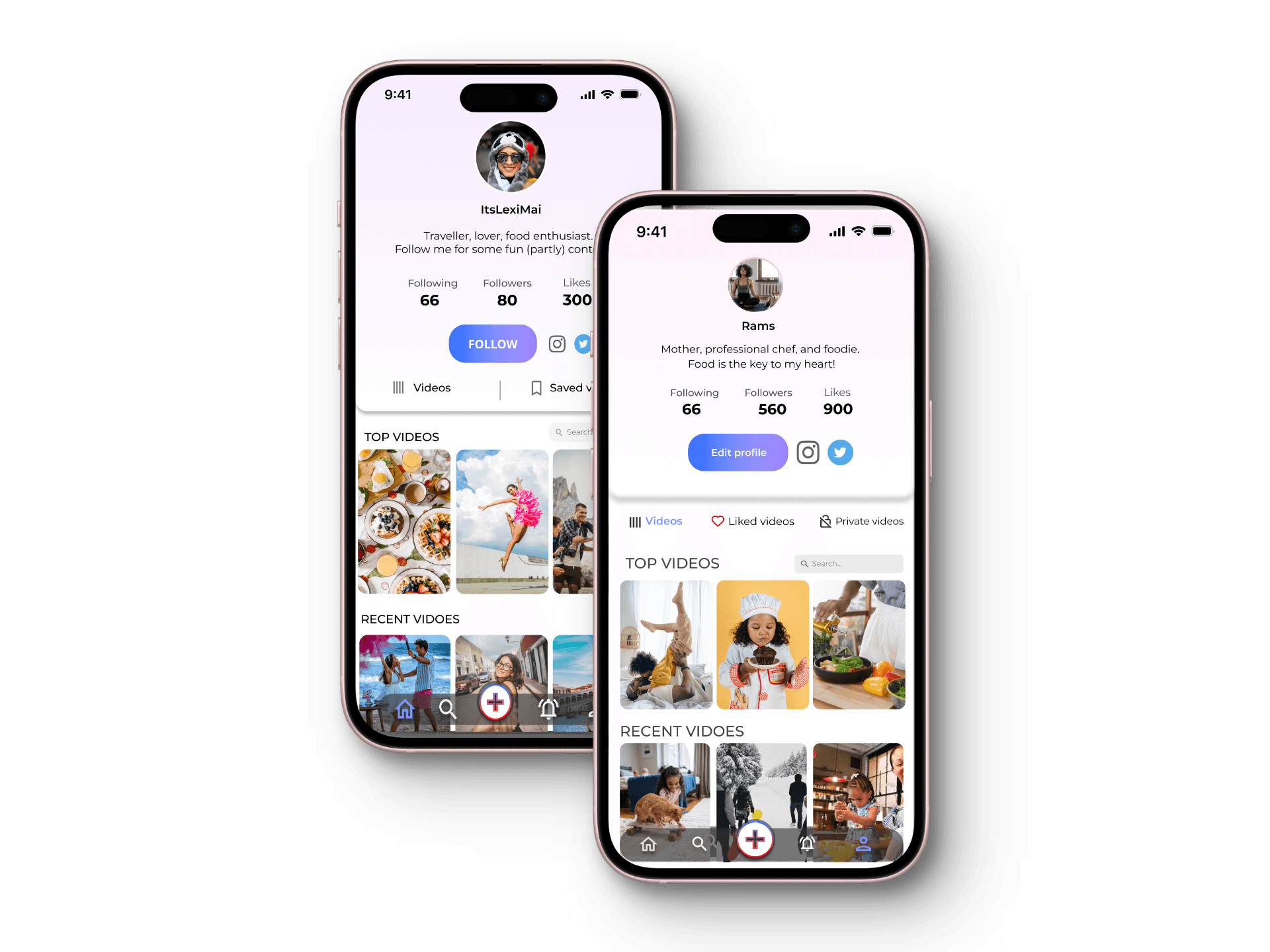
Users' top videos are pinned to the top of their profiles, making them more visible and easier to find.
Additionally, a search bar has been added to the profile section, allowing users to search for creators' videos using keywords.
This solution aims to enhance the user experience by improving the accessibility and discoverability of videos on user profiles. Users can now easily find the videos they want to watch or refer to, without the hassle of going through each one individually.
Visual Design

